Did you ever get distracted by a popup that was way too big on your smartphone, making it impossible to close? Or one so small on a tablet that you barely noticed it? It can be annoying.
A poorly designed popup can ruin the user experience, drive visitors away, and even hurt your conversion rates. But the good news is, you can easily fix this by making your popups responsive – so they adapt perfectly to any screen size, whether desktop, tablet, or mobile.
In this article, I’ll show you the best popup sizes, key design tips, and two easy ways to create responsive popups: with custom code or a WordPress plugin.
So, grab a cup of coffee and start reading – by the end of this guide, your popups should look great on every device!
What Is the Best Size for a Responsive Popup?
A good popup should be large enough to grab attention but not so big that it disrupts the user experience.
To ensure your popups are responsive and work seamlessly across all screen sizes, follow these recommended sizes:
| Device Type | Recommended Width | Recommended Height |
| Desktop | 500-800px (or 50-70%) | 300-600px (auto if possible) |
| Tablet | 60-80% of screen width | Auto (300-500px) |
| Mobile | 80-90% of screen width | Auto (should fit within 75% of the screen height) |
We have found these size ranges to be appropriate for most cases. But based on your specific requirements, you may need to change the settings.
Remember, the goal is to make the popup noticeable while still allowing users to see part of the underlying page – ensuring a smooth user experience.
Though a responsive popup should automatically adjust based on devices, you may still need to change the size of individual elements inside a popup to ensure something does not look broken on different screen sizes.
One way to maintain a responsive size for popups is using a percentage value instead of a fixed pixel. Common practice is to set the width to 50-70% of the screen for desktops and tablets and 80-90% for mobile devices.
For height, auto-adjusting based on content is best to avoid unnecessary scrolling.
How to Create Responsive Popups Based on Different Screen Size
In this section, you will learn how you can create a responsive popup for your WordPress website. There are two ways you can do this.
- Creating the popup using custom code (HTML, CSS, and Javascript)
- Creating the popup using a WordPress plugin
I will discuss both methods so that you can easily display different popup sizes based on different screen sizes.
Method 1: Creating Responsive Popups with Custom Code
Creating a responsive popup using code requires three main steps:
1️⃣ Writing the HTML structure
2️⃣ Styling with CSS (including media queries for responsiveness)
3️⃣ Adding JavaScript for interactivity
Step 1: Writing the HTML Structure
The first step is to create the HTML elements that form the popup.
<!-- Popup Overlay -->
<div class="popup-overlay" id="popupOverlay">
<div class="popup">
<button class="popup-close" id="closePopup">×</button>
<h2>Subscribe to Our Newsletter</h2>
<p>Get exclusive deals and updates straight to your inbox.</p>
<button onclick="alert('Subscribed!')">Subscribe Now</button>
</div>
</div>
<!-- Button to Open Popup -->
<button onclick="showPopup()">Open Popup</button>
Code Explanation:
✅ popup-overlay – Covers the entire screen when the popup is active.
✅ popup – The actual popup window containing the text, buttons, and close option.
✅ popup-close – A close button (×) that lets users dismiss the popup.
✅ CTA Button – A sample “Subscribe Now” button that triggers an alert when clicked.
✅ Popup Trigger Button – A button outside the popup to open it.
At this point, the popup exists but is not styled and won’t function without CSS and JavaScript.
Step 2: Styling the Popup with CSS
Next, we apply CSS styles to ensure the popup looks good and is fully responsive.
/* Background overlay (hidden by default) */
.popup-overlay {
    position: fixed;
    top: 0;
    left: 0;
    width: 100%;
    height: 100%;
    background: rgba(0, 0, 0, 0.5);
    display: none;
    justify-content: center;
    align-items: center;
    z-index: 1000;
}

/* Popup box */
.popup {
    background: white;
    padding: 20px;
    border-radius: 10px;
    box-shadow: 0 4px 10px rgba(0, 0, 0, 0.2);
    width: 50%;
    max-width: 600px;
    min-width: 300px;
    text-align: center;
    position: relative;
    animation: popupFadeIn 0.3s ease-in-out;
}

/* Close button */
.popup-close {
    position: absolute;
    top: 10px;
    right: 15px;
    background: none;
    border: none;
    font-size: 20px;
    cursor: pointer;
}

/* Fade-in animation */
@keyframes popupFadeIn {
    from {
        opacity: 0;
        transform: scale(0.8);
    }
    to {
        opacity: 1;
        transform: scale(1);
    }
}

/* Responsive Styles */
@media (max-width: 768px) { /* Tablet */
    .popup {
        width: 70%;
        max-width: 500px;
    }
}

@media (max-width: 480px) { /* Mobile */
    .popup {
        width: 90%;
        max-width: 320px;
        padding: 15px;
    }
}
Why Media Queries for Responsiveness:
Media queries adjust the popup’s size dynamically based on screen width:
✅ For tablets (max-width: 768px)
- The popup width is set to 70% of the screen instead of 50%.
- The max-width is limited to 500px to ensure it doesn’t stretch too much.
✅ For mobile devices (max-width: 480px)
- The popup width is set to 90% to make it fit small screens.
- The max-width is capped at 320px, preventing oversized elements.
- The padding is reduced to keep content visible.
Using media queries, the popup automatically scales down for smaller screens – avoiding cut-off content or unreadable text.
Step 3: Adding JavaScript for Popup Functionality
Now, you need to add a little bit of JavaScript to open and close the popup when needed.
// Function to show the popup

function showPopup() {
    document.getElementById("popupOverlay").style.display = "flex";
}

// Close popup when the close button is clicked

document.getElementById("closePopup").addEventListener("click", function() {
    document.getElementById("popupOverlay").style.display = "none";
});

// Close popup when clicking outside of it

document.getElementById("popupOverlay").addEventListener("click", function(event) {
    if (event.target === this) {
        this.style.display = "none";
    }
});
Code Explanation:
✅ showPopup() function – Displays the popup when the button is clicked.
✅ Close button event listener – Hides the popup when the close button (×) is clicked.
✅ Overlay click event – Allows users to close the popup by clicking outside of it.
By following these three steps, you now have a fully responsive popup that:
⭐ Works on desktops, tablets, and mobile
⭐ Uses clean and simple CSS for styling
⭐ Includes a smooth fade-in animation
⭐ Provides a seamless user experience
This is a lightweight and efficient solution, but if you prefer a no-code approach, you can follow the next method for even more flexibility!
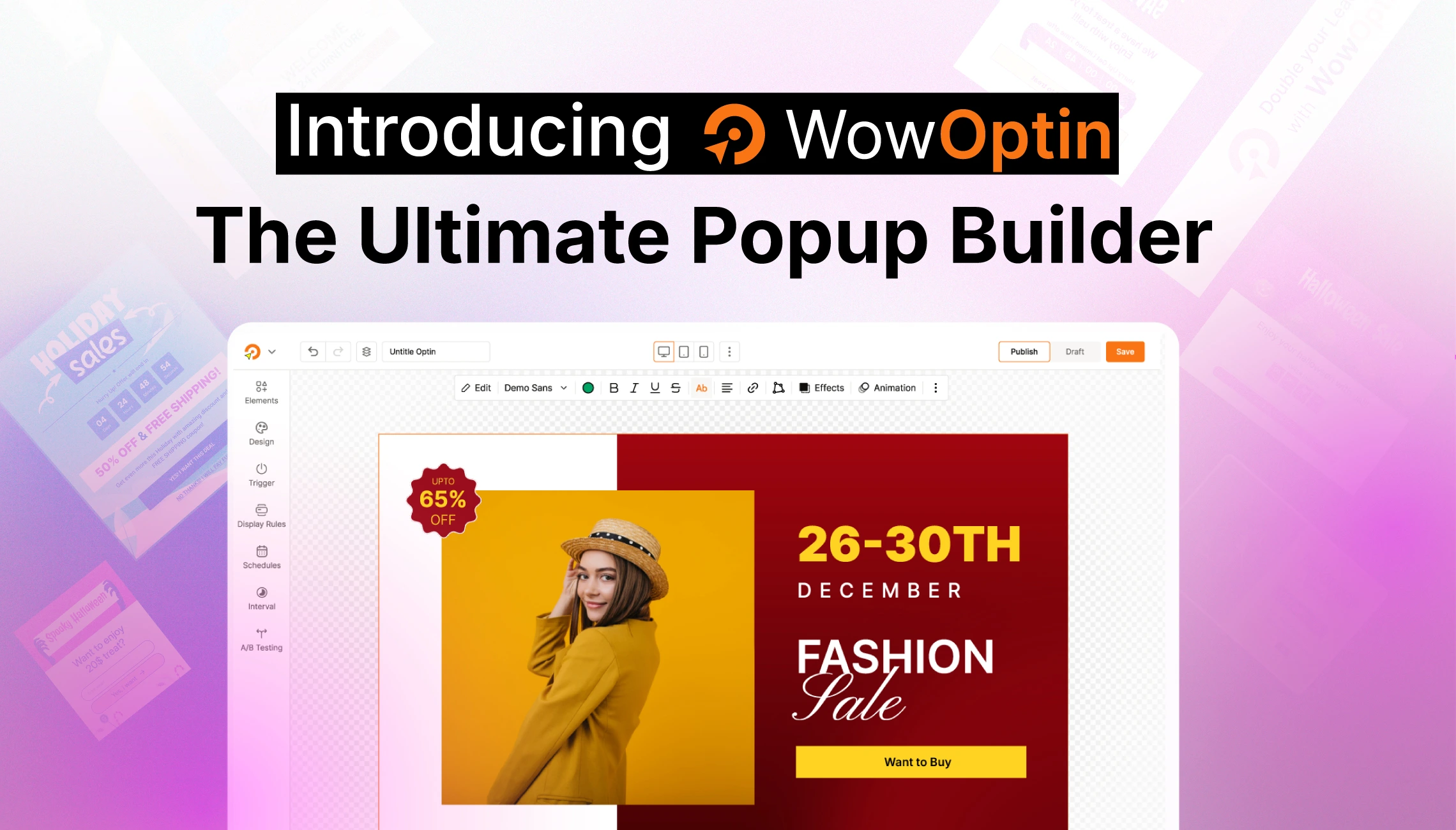
Method 2: Designing Popups for Different Screen Size With A Plugin
The popup builder plugin WowOptin lets you create fully responsive popups for all types of devices. With its user-friendly drag-and-drop editor, you can easily control how each element of your popup will look on different screen sizes.
First of all, you will need to install and activate the WowOptin plugin. It is a simple process but for your convenience here is the documentation you can follow.
Step 1: Create A Popup with Preferred Elements
After installing the plugin, go to its dashboard and click on Create New Optin. Choose a popup template you like or you can start from scratch.
For now, I will choose a popup template. You can add or remove any element you like from the editor.
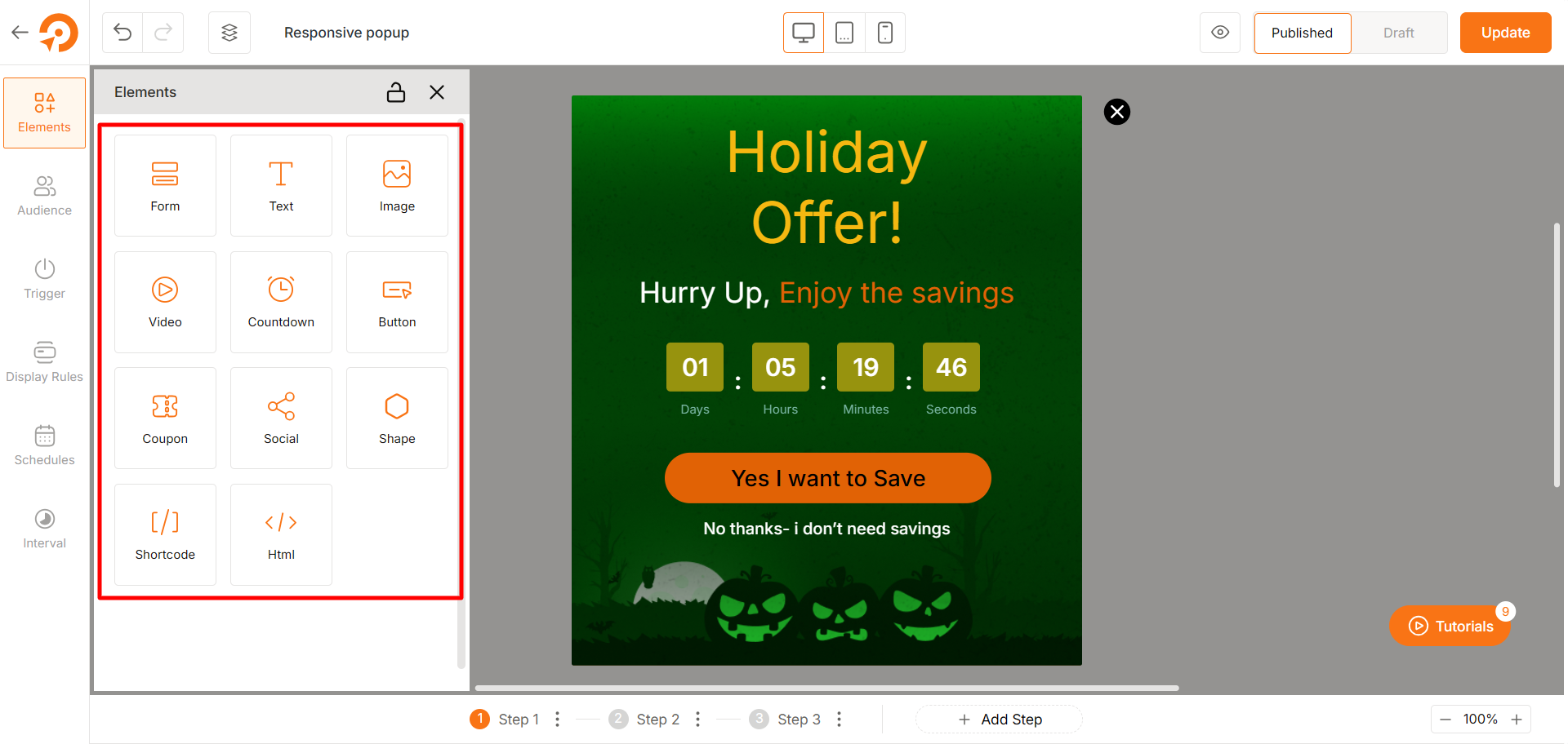
You can also edit each element’s settings such as typography, color, spacing and so on.
Step 2: Change the Size of Popup for Different Devices
WowOptin lets you easily change the size of the popup and individual elements for different screen sizes.
Let’s say you want to show the popup for tablet users. Click on the Tablet view, which is located at the top-middle position of the popup editor.
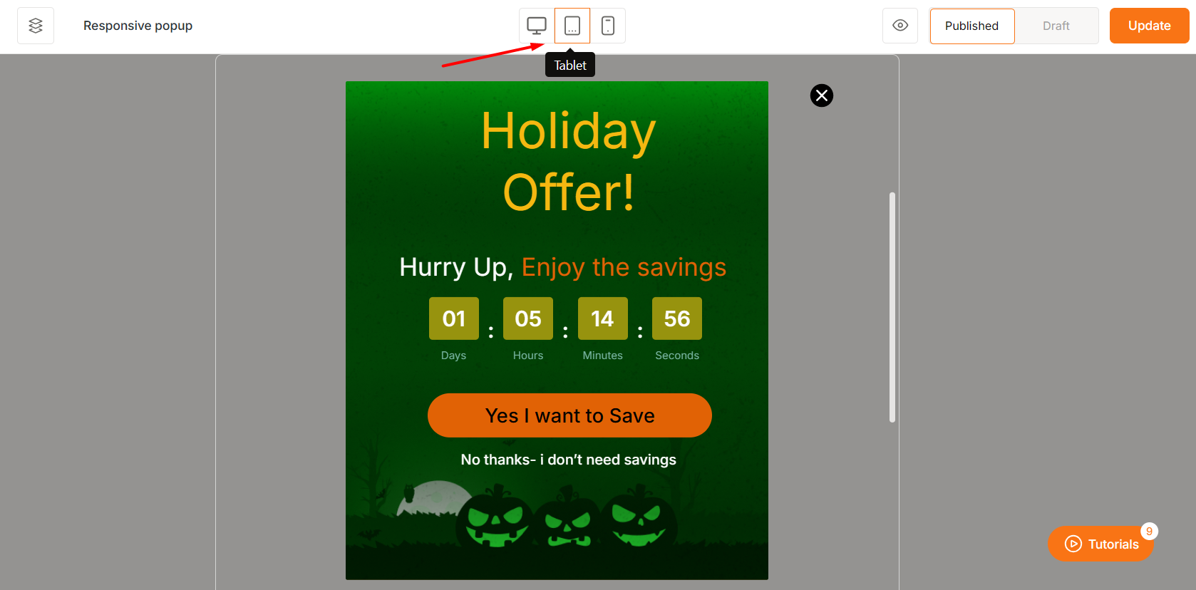
You will see the popup editor’s view has changed slightly.
Now, you can change the size dimension of the popup without any complicated steps. Click on the popup and you will see a dragging option to modify the width and height of the popup easily.
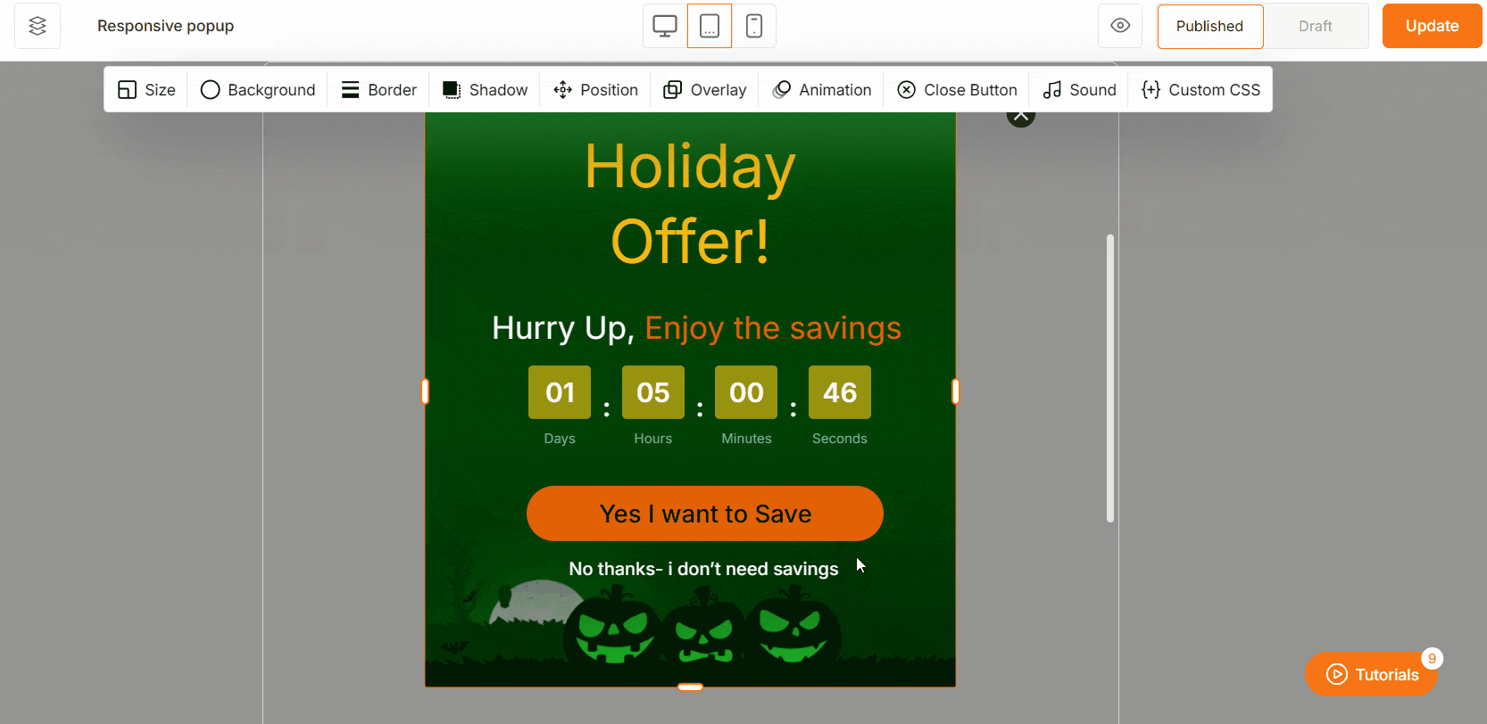
One of the major challenges for creating responsive popup is – the popup elements may look out of place or weird on different devices.
For example, let’s say, you add a Countdown timer element – it is looking fine on desktop but may look misaligned on tablet or mobile devices.
So how do we solve this? WowOptin also lets you change each element’s size settings for individual devices.
You can drag any element to reposition it and resize it without any restriction.
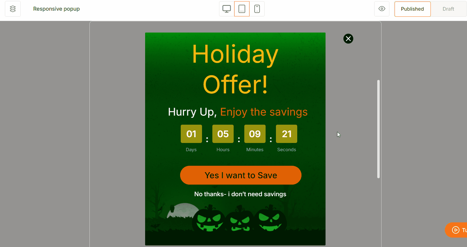
For example, I want to change the heading text “Holiday Offer!”. I simply select the element and change its size by dragging it. As simple as that!
You can resize the popup the same way for mobile devices. Just click on the Mobile view and repeat the steps from above and you should see a mobile-responsive popup.
Step 3: Apply Additional Settings
WowOptin features many awesome features like page-level targeting, audience targeting, smart triggers, and so on.
After optimizing your popup for different devices, you should implement these settings to increase conversion.
For example, I want to show this popup to users who are coming from a specific social link. That way I can easily track my social media promotional campaign’s effectiveness.
You can use the targeting feature that gives you the best result. The possibilities are countless.
Learn more about these features in our official documentation:
Step 4: Preview the Popup on Different Devices
To ensure a smooth user experience, preview your popup on various devices, including desktops, tablets, and smartphones.
Open your website on different devices and interact with the popup to check for alignment issues, readability, and responsiveness.
Using Developer Tools for Efficient Testing:
For a faster and more efficient testing process, you can use your browser’s built-in developer tools to simulate different screen sizes:
- Open Developer Tools – Press F12 or right-click anywhere on your webpage and select Inspect.
- Click on the Toggle Device Toolbar (a small mobile and tablet icon in Chrome and Edge).
- Select a predefined device like an iPad, iPhone, or Galaxy smartphone from the dropdown menu.
- Check the popup size, spacing, text readability, and ensure all elements are properly aligned.
If something looks broken on any device, you can go back to WowOptin’s popup editor and optimize it accordingly.
So, Can You Display the Same Message for Different Screen Sizes Without Creating Multiple Popups?
Yes. Instead of creating separate popups for desktop, tablet, and mobile, you can design one responsive popup that automatically adapts to different screen sizes. You can use custom coding and follow responsive best practices to design such a popup. The detailed steps have been explained above.
In addition, popup builder plugins like WowOptin allow you to create device-specific rules. For example, you can set a popup to appear only on mobile while keeping the desktop experience clutter-free.
Can You Display Different Popups for Different Devices?
Yes, of course. Using a popup builder plugin like WowOptin that has a device targeting feature – you can easily show different popups for different screen sizes.
Simply create a popup using WowOptin and move to the Audience tab in the popup editor view. Now, you should see the Visitor Devices setting.
From here, click on Specific Devices and choose for which devices the popup should be visible.
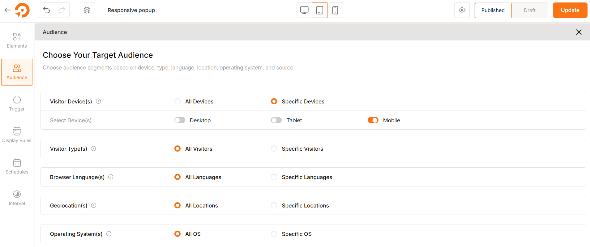
If you want to show this popup only to mobile users, disable the other options.
Then create another popup and enable it only for desktop and opt out from other options.
This way you can showcase completely different popups for different devices.
Best Practices to Create Responsive Popups
Avoid Intrusive Popups on Mobile
Google penalizes websites that use intrusive banners and popups blocking the view of the main content of the page. So, you should properly optimize the popups for all types of devices. Make sure the popups don’t take up the entire space on mobile screens.
You can also use slide-ins, floating bars, or smaller modal popups that take up no more than 30% of the screen height. This will allow your visitors to access the main content without frustration.
Make Close Buttons Easy to Tap
A popup should always have a visible and accessible close button. It should be large enough (at least 40px × 40px) and placed in a familiar position, such as the top right corner.
Users should also be able to close the popup by clicking outside of it or pressing the Esc key on desktops.
Keep It Lightweight and Fast
Popups with excessive animations, videos, or high-resolution images can slow down page speed, especially on mobile devices.
To improve performance, use lightweight CSS animations instead of JavaScript-heavy effects and ensure that the popup doesn’t preload unnecessary scripts.
Optimize Images for Mobile
Images inside popups should be optimized for fast loading without compromising quality.
Use compressed image formats like WebP or JPEG, and consider serving different image sizes based on the screen resolution.
Test on Multiple Devices and Screen Sizes
Before publishing a popup, test it on multiple devices and browsers to ensure proper responsiveness.
You can use browser developer tools (Ctrl + Shift + M in Chrome) to simulate different screen sizes and tweak the popup design accordingly.
Frequently Asked Questions
What Is The Best Free Plugin to Design Responsive Popups?
There are several great options, but WowOptin is a great popup builder because it comes with a free version without compromising on features. It lets you create fully responsive popups with a drag-and-drop editor. You can customize them for different screen sizes without coding. It also features advanced targeting, smart triggers and other awesome features.
How Can I Prevent Google From Penalizing My Mobile Popups?
You should avoid full-screen popups that cover the entire page content, as Google penalizes intrusive interstitials. Instead, you can use slide-ins, or banners that don’t block content. This keeps your website SEO-friendly while still capturing leads.
Can I Create A Different Popup For Mobile And Desktop?
Yes, you can create different popups for mobile and desktop using a popup builder tool like WowOptin. However, it’s usually better to create one responsive popup that adjusts automatically. This saves time and ensures a consistent experience across devices.
Do Responsive Popups Affect Website Speed?
If optimized properly, responsive popups won’t slow down your site. Keep them lightweight, lazy-load images, and avoid heavy animations. This way, your popups stay fast and smooth for all users.