The Social Element is designed to seamlessly integrate social media links into your designs. It enables users to connect with their favorite platforms directly. This element is versatile, visually appealing, and fully customizable to fit your style.
How to Use the Social Element
Follow these steps to add and customize your Social Element:
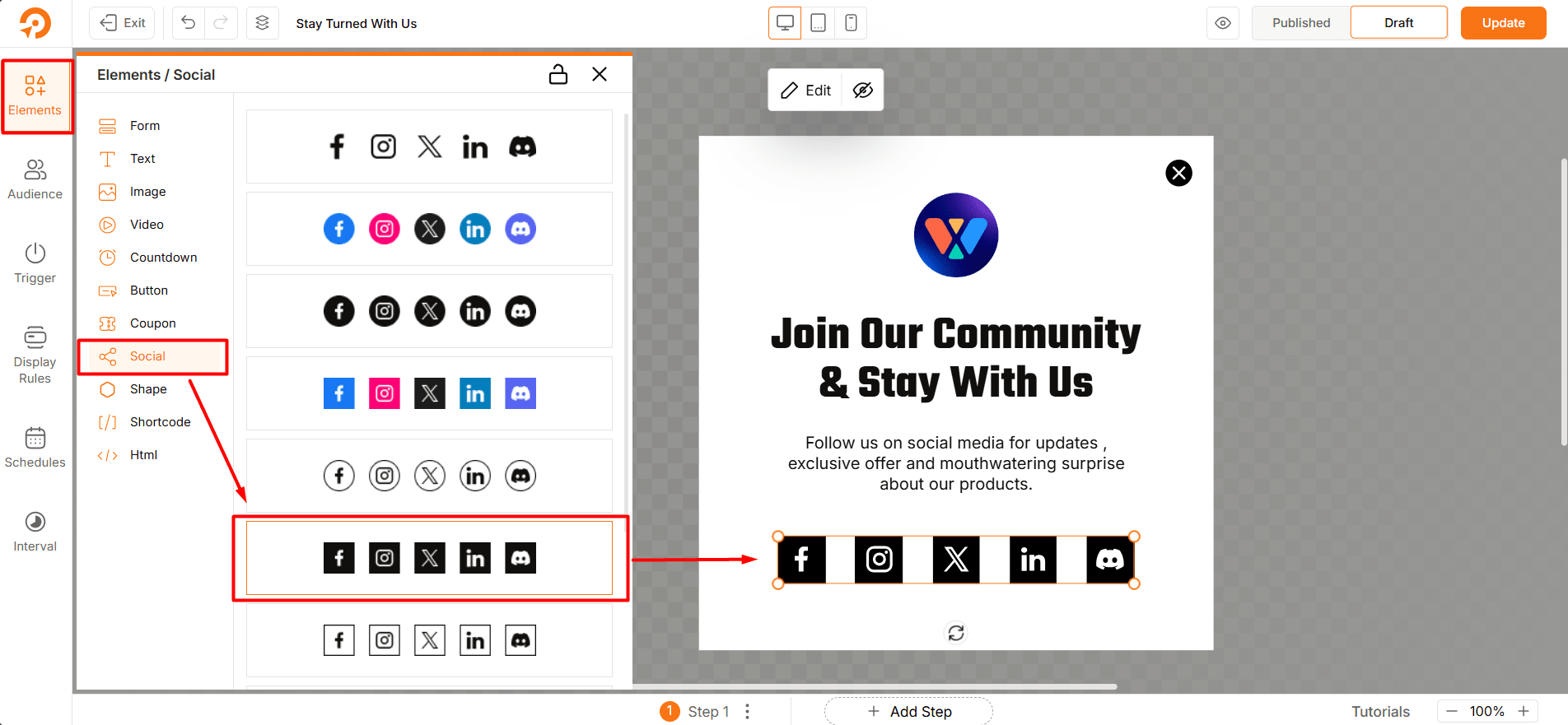
- Drag and drop the Social Element into the canvas.
- Click on the element to configure the social platforms.
- Adjust the design and layout using the customization options provided.
Social Click Tracking
WowOptin provides automatic click tracking for the Social elements used in your opt-ins. This allows you to measure follow and share interactions without any manual setup. Here are some Key Details:
Automatic Tracking
Social click tracking (for both follow and share) is enabled by default. You do not need to enable any additional settings.
Dashboard Analytics
Tracked social clicks are displayed in the main analytics dashboard.
Quick Analytics
Each opt-in has its own quick analytics view, where you can see social click data specific to that opt-in.
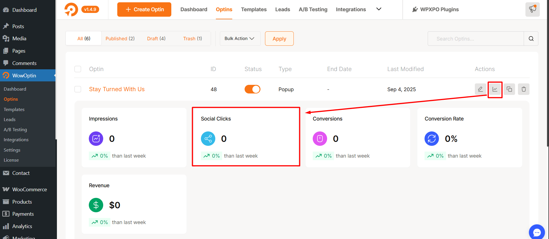
✅ This makes it easy to monitor how users engage with your social follow and share buttons directly from your opt-ins.
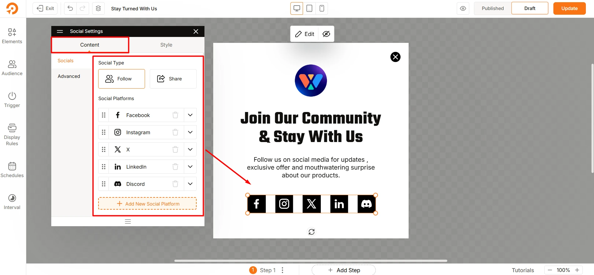
Customization Options
The Social Element offers a variety of features to personalize the appearance and functionality:
Social Platforms
- Add New Platform: Select from a list of popular platforms like Facebook, Instagram, Twitter, LinkedIn, and Discord.
- Enter URL: Provide the URL for each platform to direct users to the desired social profile or page.
- Inline View: Enable or disable inline arrangement for social icons.
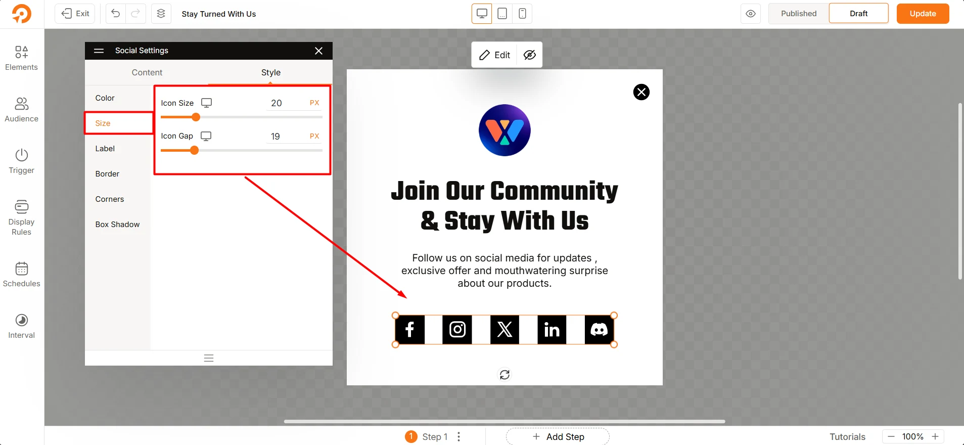
General Settings
- Icon Size: Adjust the size of the social icons to fit your design.
- Space Between: Control the spacing between each icon for better alignment.
- Enable Label: Add text labels (e.g., “Facebook,” “Instagram”) beside the icons for clarity.
- Alignment: Choose the alignment of labels relative to the icons (e.g., Bottom, Right).
- Space Between Icon & Text: Fine-tune the distance between the icon and its label.
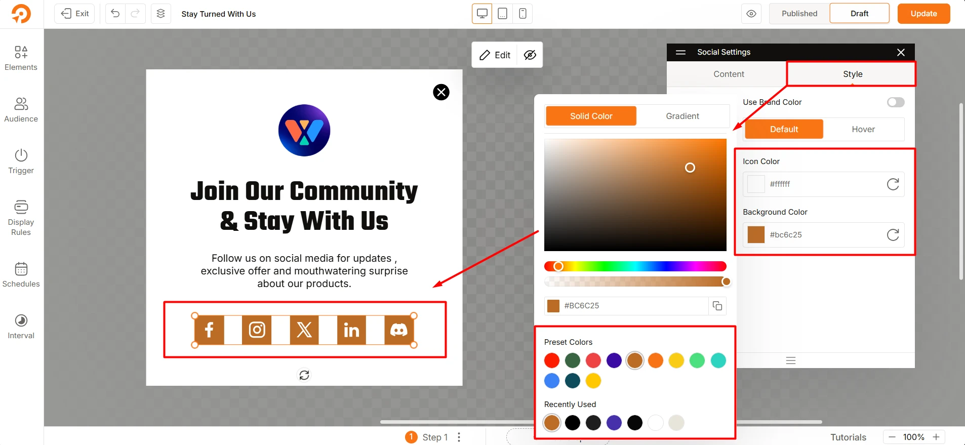
Color Customization
- Normal State: Set default colors for:
- Icon
- Label
- Background
- Border
Style Customization
Box Shadow Settings:
- Adjust Horizontal and Vertical shadow offsets.
- Customize Blur and Spread for shadow intensity.
- Choose a shadow Fill Color and control its Opacity.
Troubleshooting
- Icons Not Displaying Correctly: Ensure the selected social platform and URL are properly configured.
- Spacing or Alignment Issues: Adjust spacing and alignment settings in the Style section.
- Hover Effects Not Working: Verify that hover colors and states are correctly defined.