Great! You’re now inside the WowOptin builder. When you click anywhere on the canvas, you’ll see the Global Bar at the top. This is your main control center to start customizing your optin.
The Global Customization Bar includes up to ten tabs (some tabs may not appear depending on the optin type you create):

- Size – Adjust the width, height, and overall dimensions of your optin.
- Background – Set background color, gradient, or image to match your brand.
- Border – Control border style, thickness, and radius for sharper or rounded edges.
- Shadow – Add drop shadows for depth and focus.
- Position – Choose exactly where your optin will appear on the page.
- Overlay – Enable and customize the background overlay behind your optin.
- Animation – Set entry and exit animations to grab attention.
- Close Button – Customize how users can close the optin. Options include button design, placement, and delay.
- Sound – Add a sound effect to play when the optin appears.
- Advanced – Fine-tune advanced settings such as custom CSS, visibility rules, or device targeting.
Let’s go through them one by one!
Size Tab Overview
The Size tab allows you to control the dimensions of your optins or popups. You can choose from three presets: Small • Medium • Large
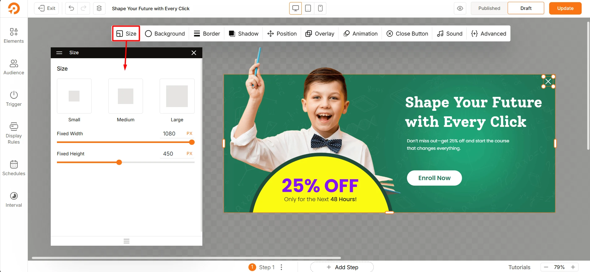
Custom Dimensions: You can also fine-tune the size using the Fixed Width and Fixed Height sliders, selecting values from 0 to 999 pixels.
Visual Resizing: Additionally, you can resize your optin or popup directly on the canvas by dragging the selectors. This method is intuitive and flexible, letting you see changes visually.
For precise control, the sliders in the Size tab let you define exact pixel dimensions.
Background Tab Overview
Here you can customize the background of your optin with colors, images, and videos. See how:
Solid – Set a solid color from the color wheel.
Gradient – Or create a gradient transition between colors.
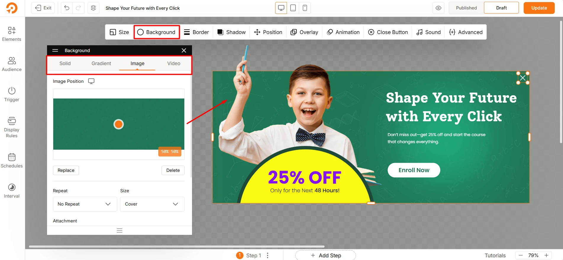
Image – You can use an image as the background with the following options:
- Replace / Delete: Upload or remove the image
- Position: Set Left and Top positioning in percentage
- Repeat: Choose an option for image repetition
- Size: Choose among Contain, Cover, and Auto to fit the image
- Attachment: Choose among Fixed, Scroll, and Local attachments.
- Fallback Color: Pick a fallback color if the image fails to load.
- Show Overlay: You can use overlay effect above the image.
Video – Set a background video for a dynamic effect.
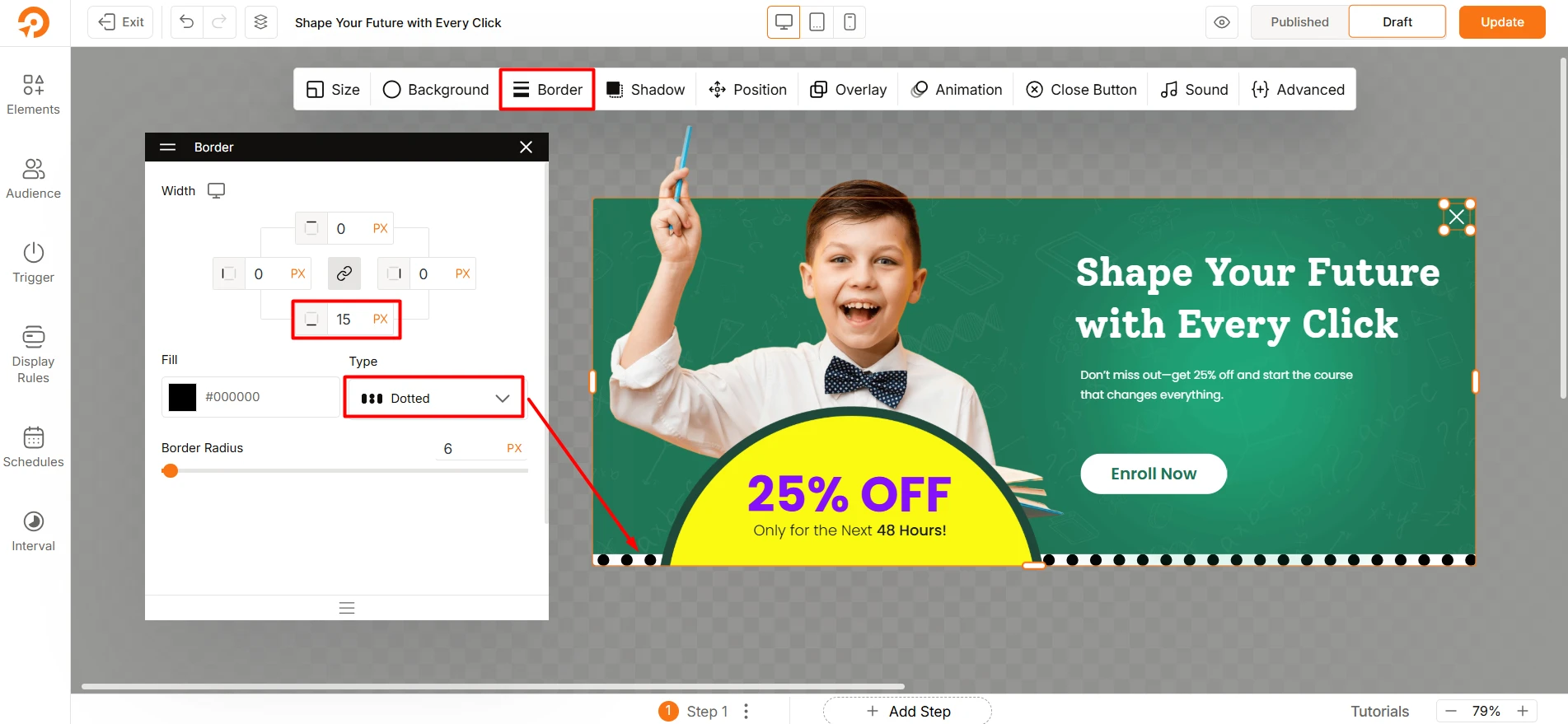
Border Tab Overview
In this tab, you can add and adjust the border of your optins or popups. Options like border style and border radius also available. See how you can do it:
Border Width: You can set border width per side (Top, Right, Bottom, Left) in pixels. And also adjust it device specific like for Desktops, tablets, and mobiles.
Fill Color: Select a color for the border from the color wheel.
Border Style: Choose any from 6 border styles. These are: Solid, Dotted, Dashed, Double, Groove, Ridge
Border Radius: Create rounded corners by adjusting the radius in pixels, rem, and percentages.
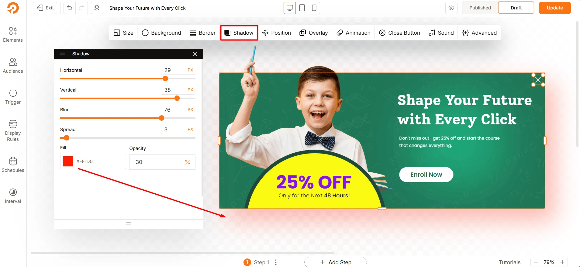
Shadow Tab Overview
This tab lets you to add depth to your popups or floating bars. You can adjust every detail of the shadow effect including blur and spread intensity. Here’s how you can do it:
Horizontal Adjustment: Adjust the horizontal shadow offset in pixels (positive values move right, negative left).
Vertical Adjustment: Adjust the vertical shadow offset in pixels (positive values move right, negative left).
Blur Intensity: Control the blur intensity for a softer or sharper shadow edge. Value ranges from 0 to 100.
Spread: Increase or decrease the shadow spread using the slider and value ranges from 0 to 100.
Shadow Color: Choose the shadow color from the color wheel.
Opacity: Set shadow transparency from 0 to 100 percentage.
Position Tab Overview
In this tab, you can choose where your optin or popup will appear on the webpage. This flexibility allows you to test and find the best spot for your audience. The grid provides a 360-degree view of options which covers almost every area of the screen for placing your popup.
- By default, the center position is selected. This means the popup will appear at the center of the screen.
- But, you can click on any box within the grid to choose your preferred position.
- You can further adjust the positioning using the Position Adjustment Sliders.
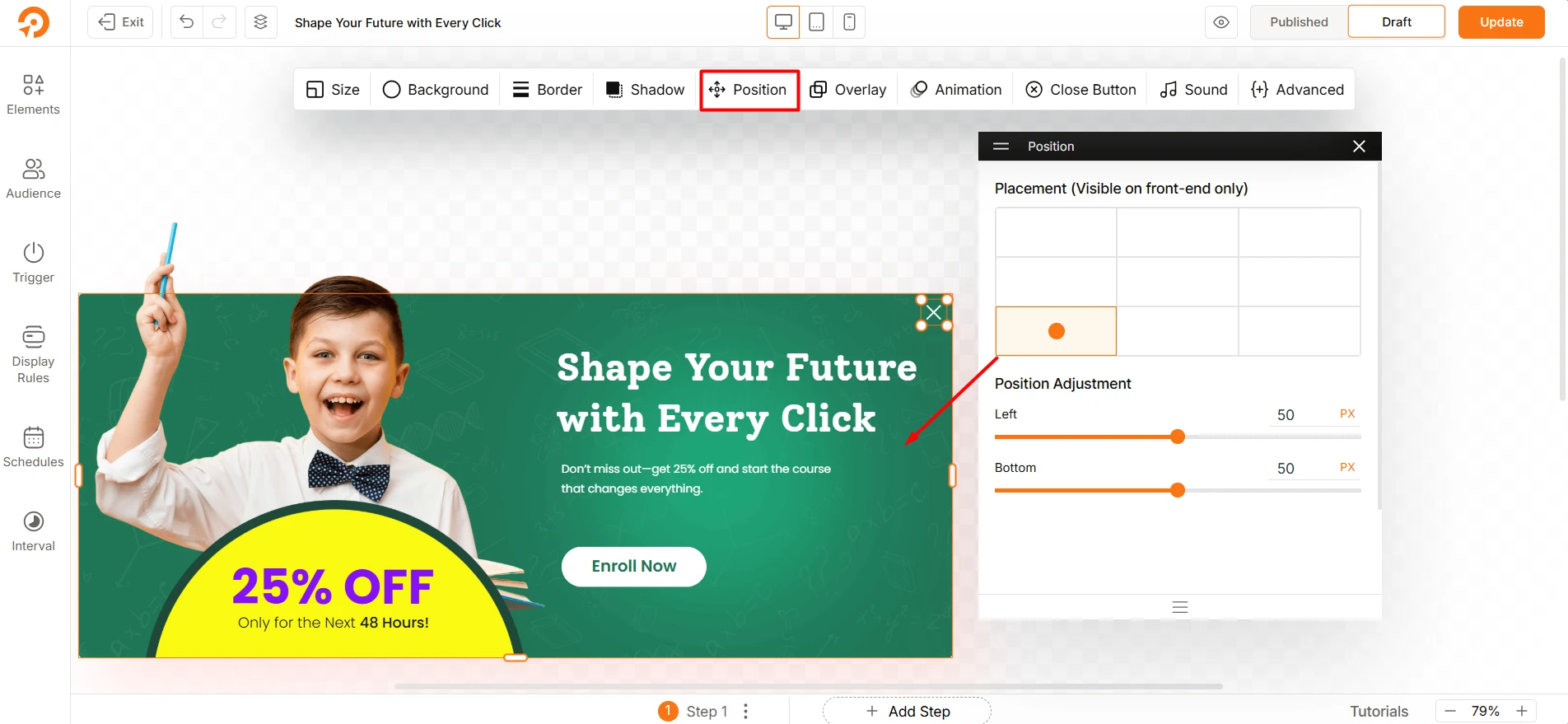
Note: The position you select here is only visible on the front end of your site.
Quick Tips for Postitoning
- Central placement captures attention quickly and is ideal for urgent calls to action.
- Side or corner placements are less intrusive and work well for subtle optins, especially if you don’t want to interrupt the user’s experience.
Overlay Tab Overview
In this tab, you have all the options to set an overlay for your optin or popups. Let’s see how you can do it:
- First, hit on the Enable Overlay toggle.
- Add color for the overlay using the color grid.
- Adjust the transparancy from the opacity field ranges from 0 to 100.
- Finally, you can Prevent Page Scrolling while the optin is displayed.
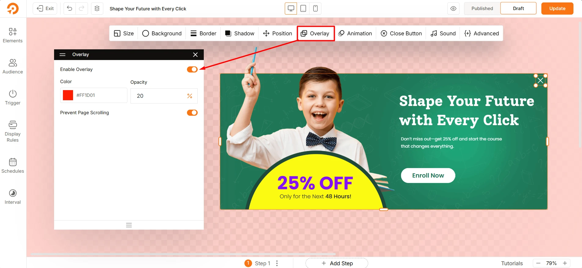
That’s all here. Pretty simple and clean.
Animation Tab Overview
This section is pretty straightforward, you can set the Entrance Effect and Exist Effect for your popups. It control how your popups appears and disappers on the screen. There are a bunch of effects for each.
Select Entrance Effect: Choose the entrance effect from 11 different variations. These are:
None, Unfold, Zoom In, Fade In, Shrink In, Flip In, Slide Up In, Slide Down In, Slide Left In, Slide Right In, Rotate In
Select Exit Effect: Select the exist effect from 10 different variatrions. These are:
None, Zoom Out, Fade Out, Shrink Out, Flip Out, Slide Up Out, Slide Down Out, Slide Left Out, Slide Right Out, Rotate Out
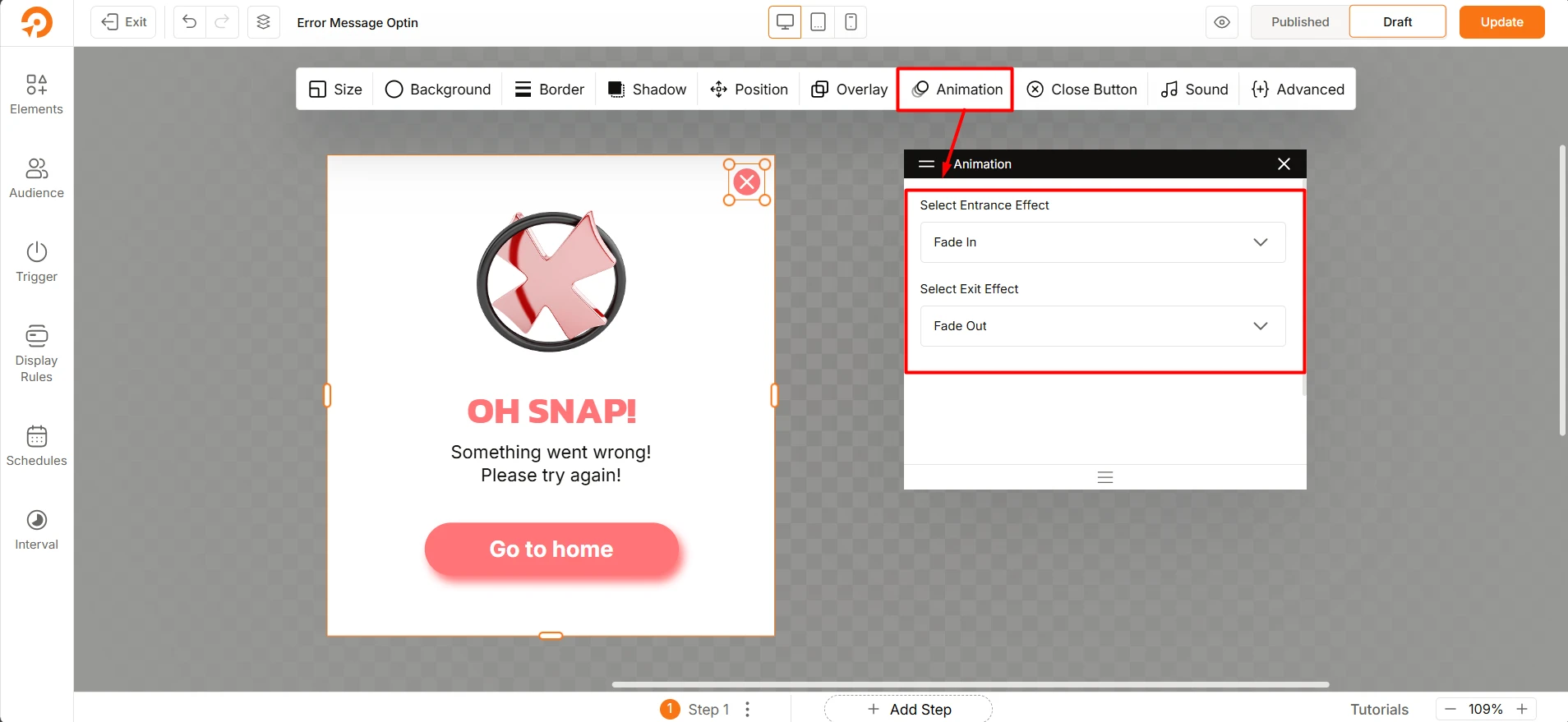
Note: You can select the “None” option if you prefer no animation.
Close Button Tab Overview
This tab lets you customize the close button for your optin. These options give you control over its style, placement, and behavior. You can decide how your audience can dismiss the optin. Let’s understand each option!
First, you have to Enable Close Icon
Choose Icon: Select an icon style for the close button There are five varitions available.
Color Customization: Customize the button’s fill color, border color, and icon color.
Close Icon Size and Placement: You can adjust the size of the close icon using the selectors and reposition it by dragging it across the canvas.
Close Button Visibility: Choose whether the close button is always visible or only shows on hover.
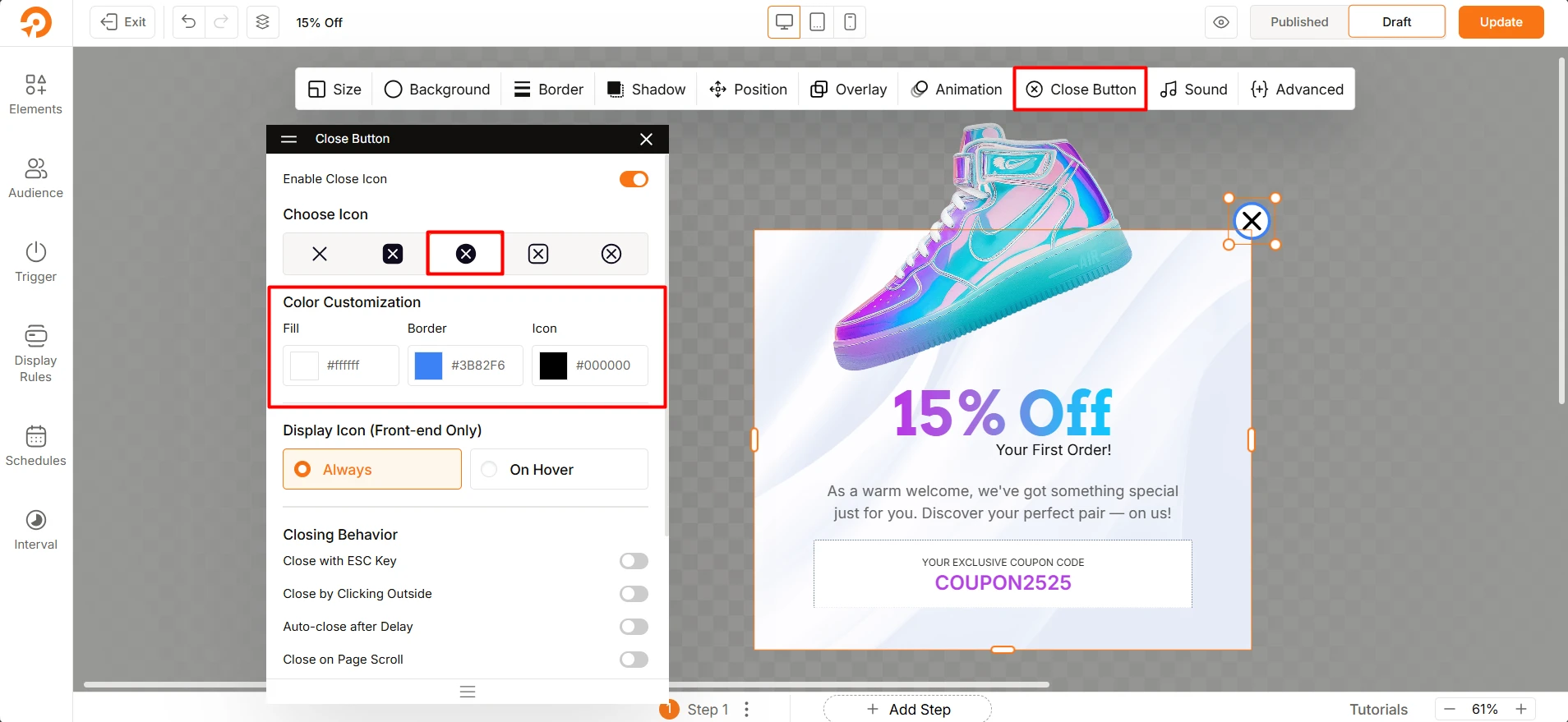
Closing Behavior: ou have four options that let users close the optin or popup.
- Close with ESC Key: Allow closing the optin by pressing the ESC key
- Close by Clicking Outside: Close the optin by clicking outside of it.
- Auto-close after Delay: Set a time (in seconds) to close automatically.
- Close on Page Scroll: Close the optin when the user scrolls.
Sound Tab Overview
The Sound tab lets you add an audio effect when your optin or popups is appeared.
Select a Sound Effect
Click the dropdown to choose from the available options:
- No Sound – No audio will play.
- Beep 1, Beep 2, Beep 3 – Short notification beeps.
- Success – Plays a success tone.
- Error – Plays an error tone.
- Chime – Gentle chime sound.
- Correct – Confirmation sound for correct actions.
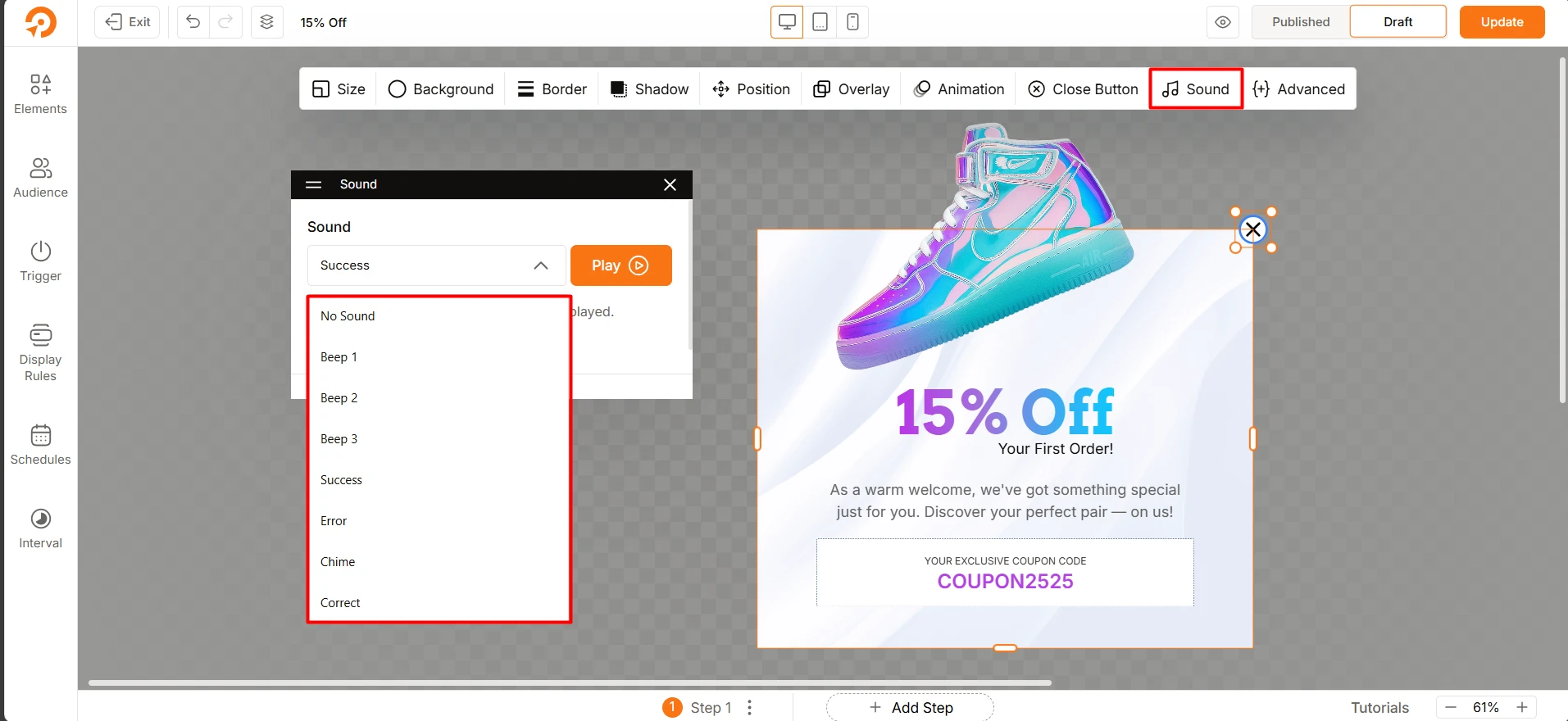
After selecting a sound, click the Play button to hear it before applying.
Tip: Adding a sound can help grab your audience’s attention when the optin appears, but use it carefully to avoid being intrusive.
Advanced Tab Overview
This tab provides options for advanced styling and customization of the optins. You can use these settings to apply custom CSS and classes that go beyond the standard styling controls.
Custom CSS
The Custom CSS field allows you to add your own CSS rules to target and style the element. Any CSS you write here will be rendered on the frontend.
- Syntax: All CSS selectors within this field must be preceded by
{{optn}}. - Example: To change the color of the element’s text to red, you would enter:{{optn}} { color: red; }
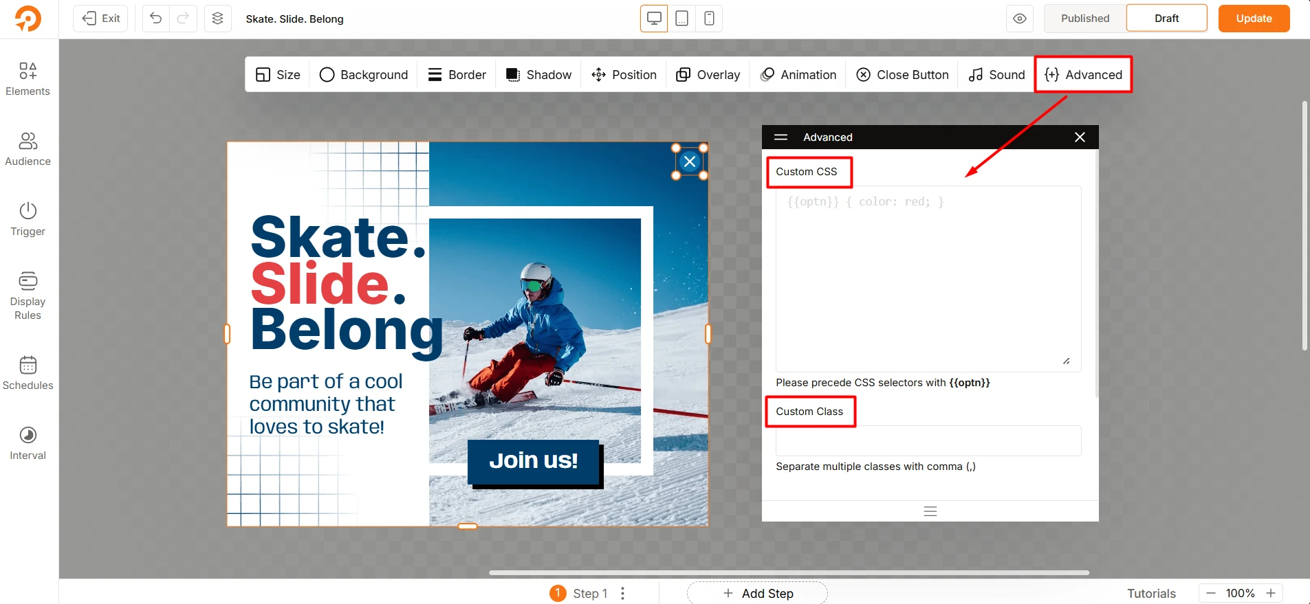
Custom Class
The Custom Class field lets you add one or more custom CSS classes to the element. These classes can be used to apply styling from your theme’s stylesheet or a custom stylesheet.
- Syntax: Separate multiple classes with a comma (
,). - Example: To add two classes, my-class and highlight, you would enter:my-class, highlight