The Button Element is an essential interactive component that enhances user engagement by enabling actions like form submissions, redirects, and more.
Whether you’re guiding users to a specific page, tracking conversions, or adding visual appeal, the Button element provides full customization for a seamless experience.
How to Use Button Element
Getting started with the Button Element is simple:
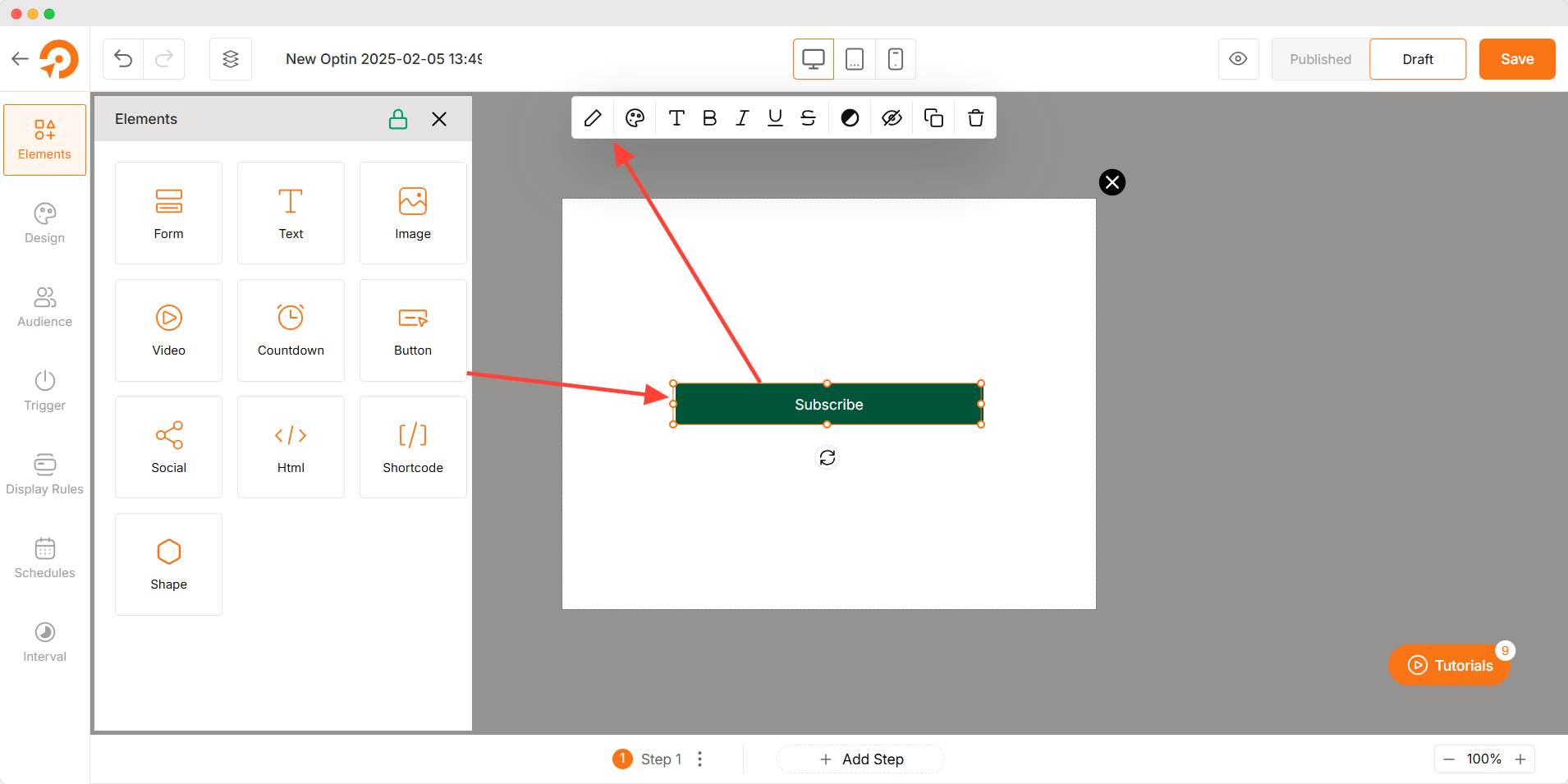
- Drag and drop the Button Element into the canvas.
- Click on the button to edit its text and customize its settings.
- Configure the button actions, styles, and typography to fit your design and functionality needs.
Customization Options
The Button Element offers extensive customization settings to enhance both functionality and aesthetics.
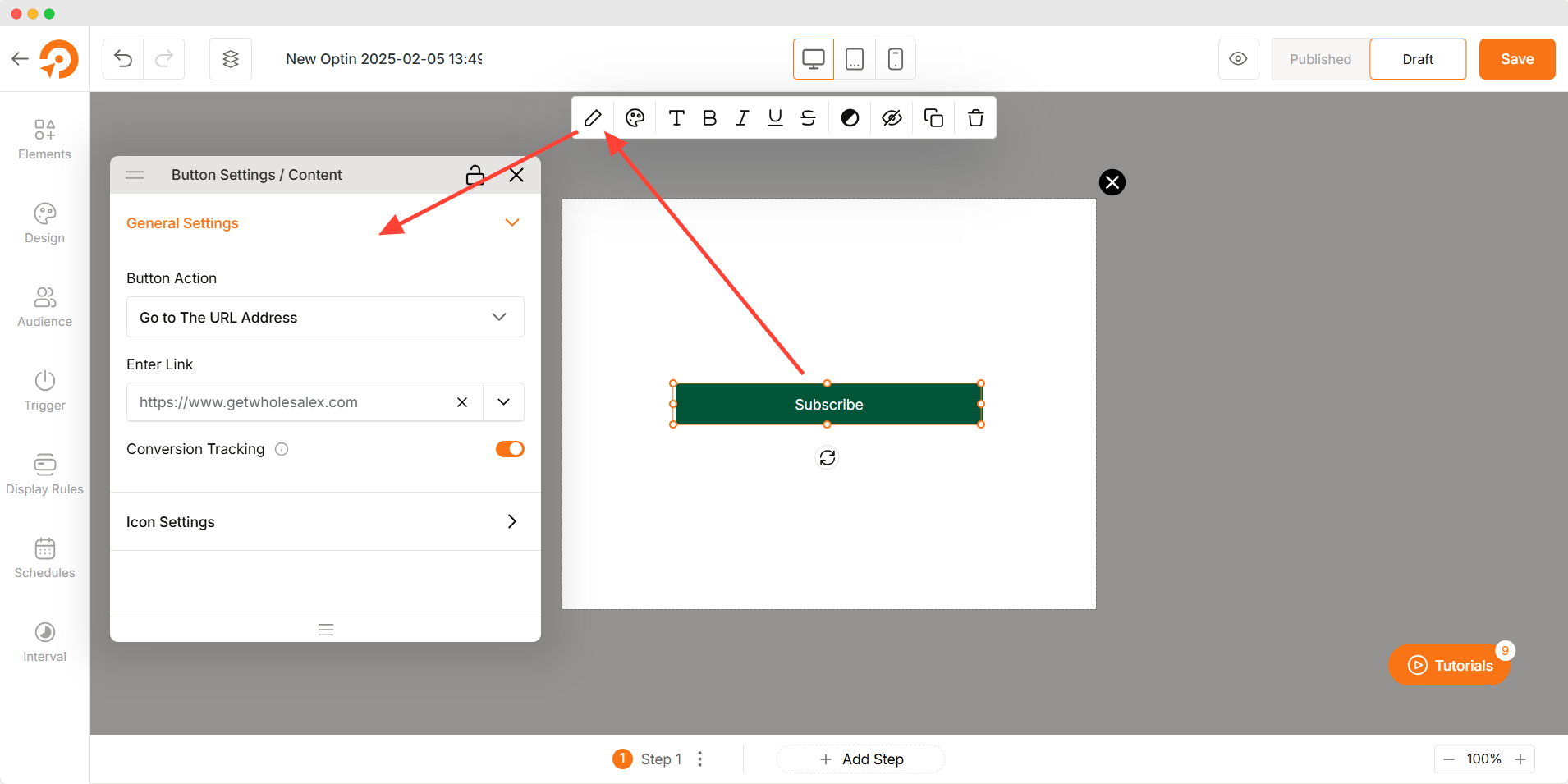
Button Settings
- Button Action: Define what happens when the button is clicked. Options include Go to the URL Address, Show next step, Call a phone number, and Close Optin.
- Enter Link: Add a URL to direct users to another page, either internally or externally.
- Conversion Tracking: Enable tracking to measure clicks and interactions for performance analysis.
- Icon Library: Choose and add an icon to the button for visual enhancement.
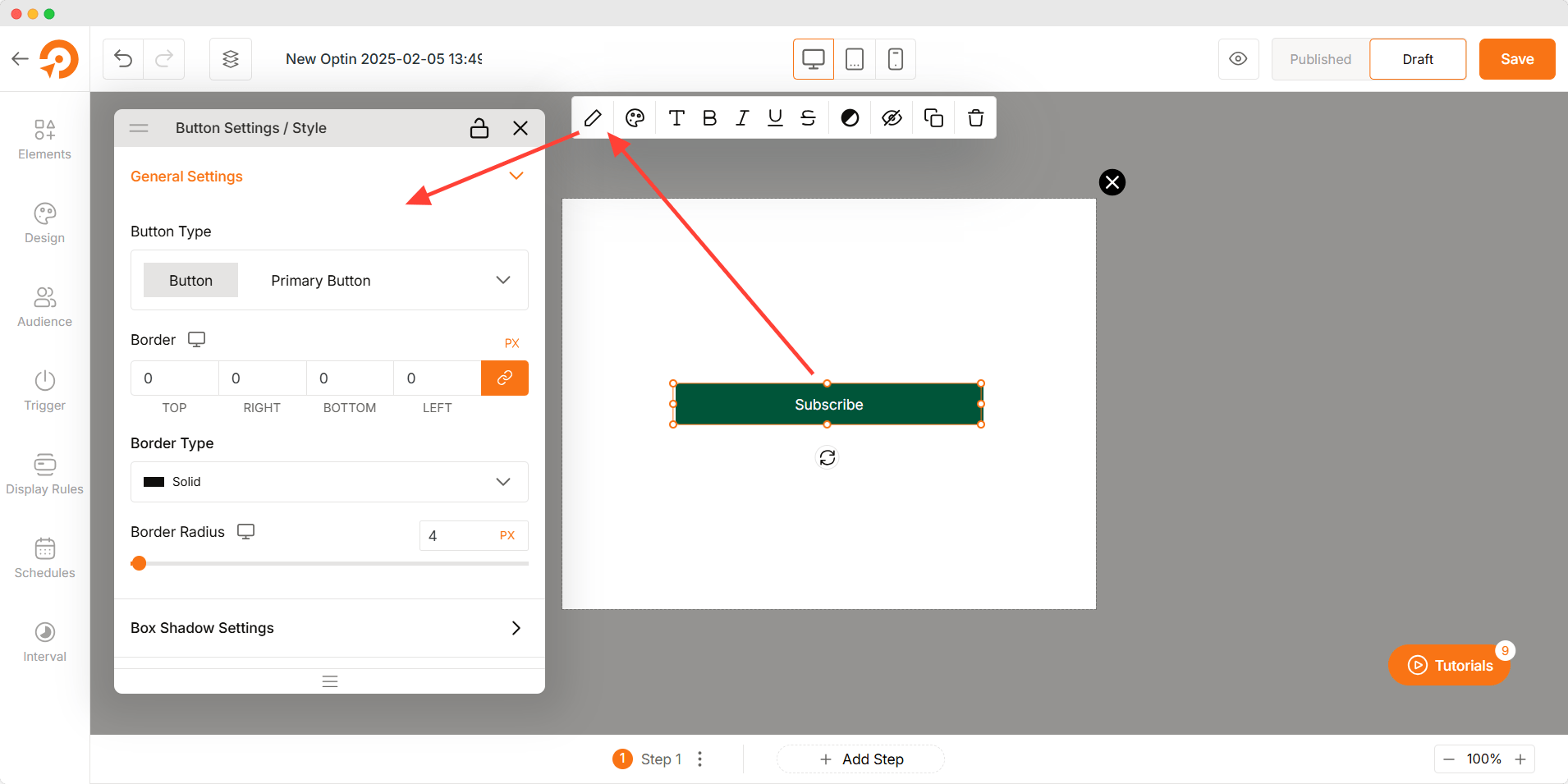
Button Styles
- Button Type: Choose from predefined button styles such as solid, outline, or ghost.
- Border Type: Select a solid, dashed, or dotted border.
- Border Radius: Adjust the corner roundness for a sharp or soft appearance.
- Button Shadow: Apply shadow effects to create depth and emphasis.
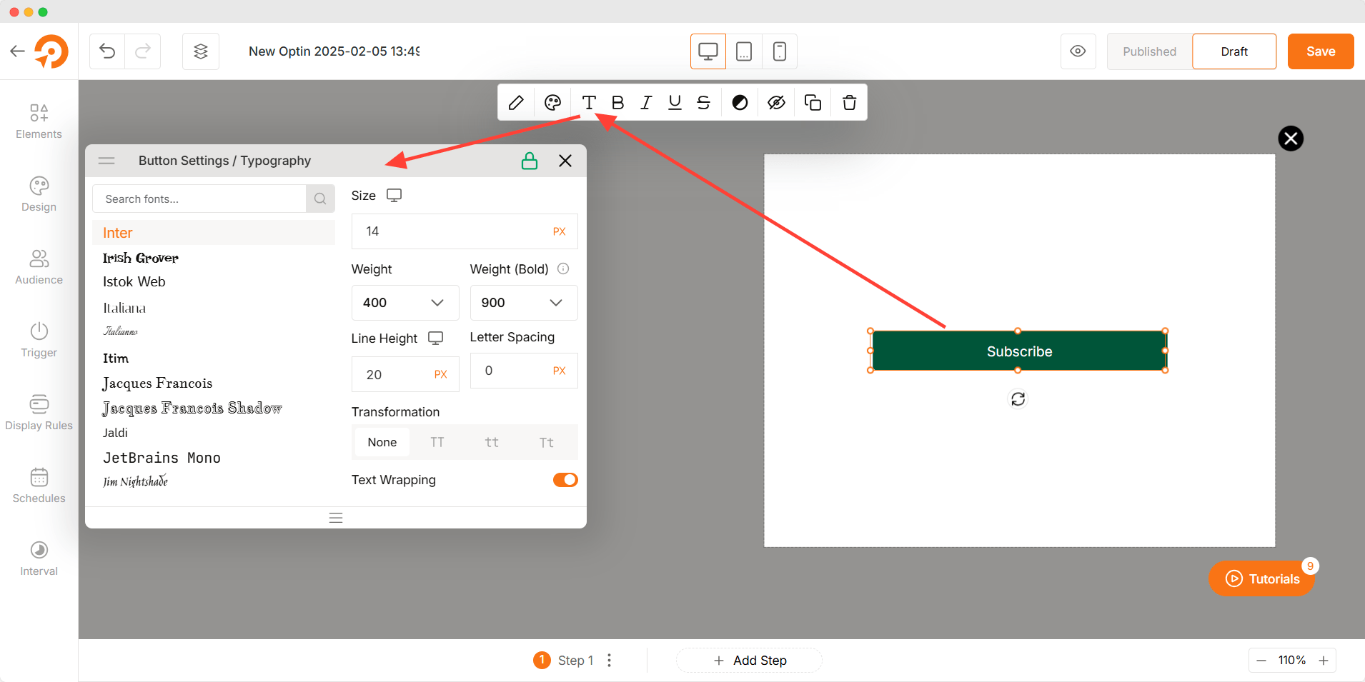
Typography
- Font Selection: Pick from a wide range of fonts to align with your brand’s style.
- Font Size: Adjust the text size for optimal readability.
- Font Weight: Modify the thickness of the text, from light to bold.
- Line Height & Letter Spacing: Control text spacing for better clarity.
- Text Transformation: Convert text to uppercase, lowercase, or capitalized.
- Text Wrapping: Manage text overflow to ensure a clean look.
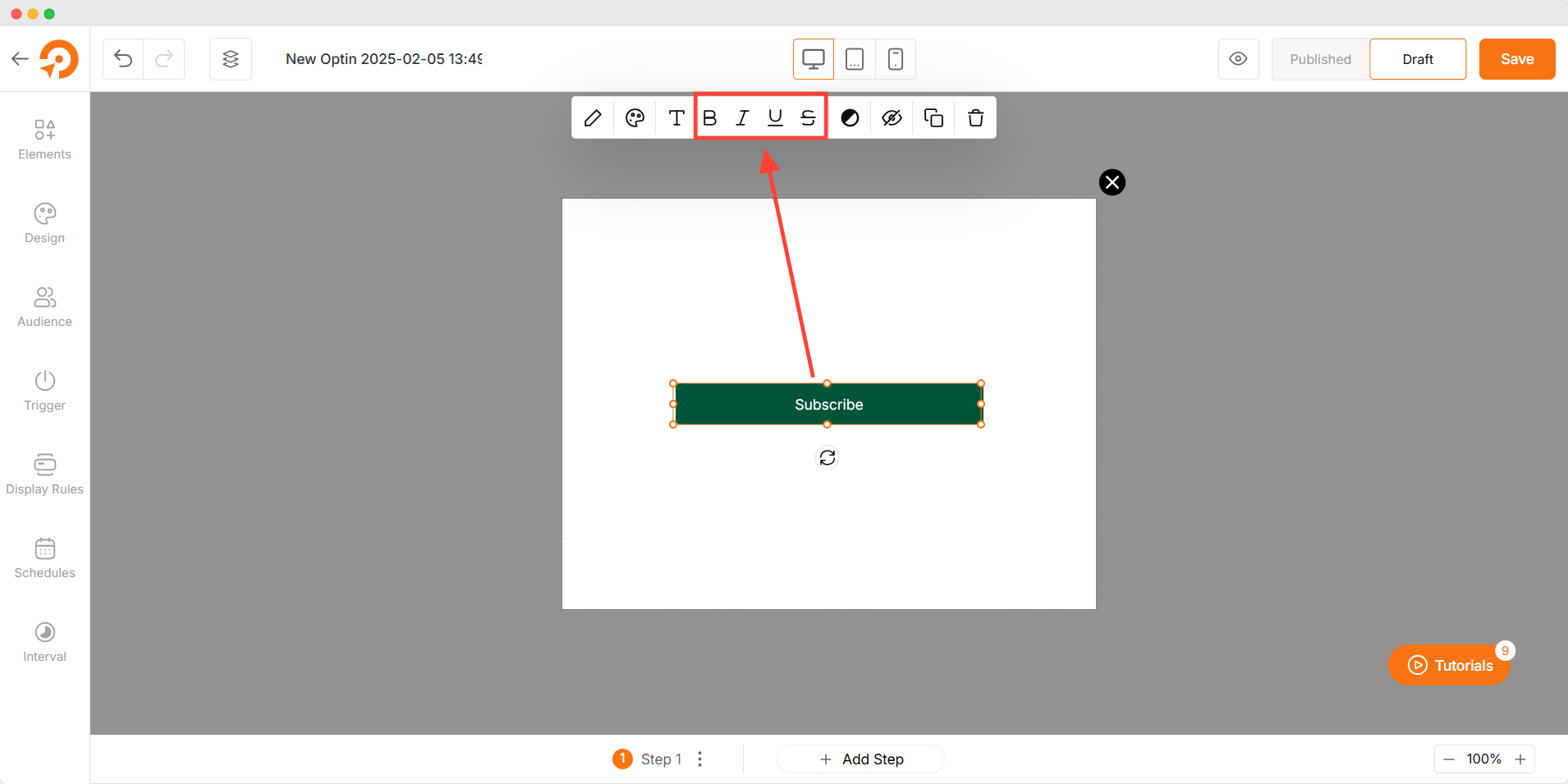
Text Formatting
- Bold: Emphasize text by making it bold.
- Italic: Add a slanted effect for emphasis or style.
- Underline: Highlight important text with an underline.
- Strikethrough: Show updates or corrections with a strikethrough effect.
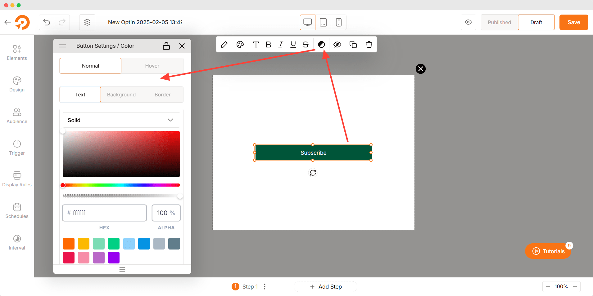
Color Customization (Both in Normal and Hover States)
- Text Color: Customize text color for normal and hover states.
- Background Color: Define solid or gradient backgrounds for normal and hover states.
- Border Color: Adjust the border color separately for normal and hover states.
Troubleshooting
- Icon Not Showing: Confirm that an icon is selected and properly configured.
- Button Not Working: Ensure the button action is correctly set up.
- Link Not Redirecting: Double-check the entered URL and link behavior settings.