The Form Element is a crucial component for capturing user data, generating leads, and enabling interactions.
Whether you’re collecting email sign-ups, inquiries, or survey responses, this element provides a flexible and customizable form-building experience.
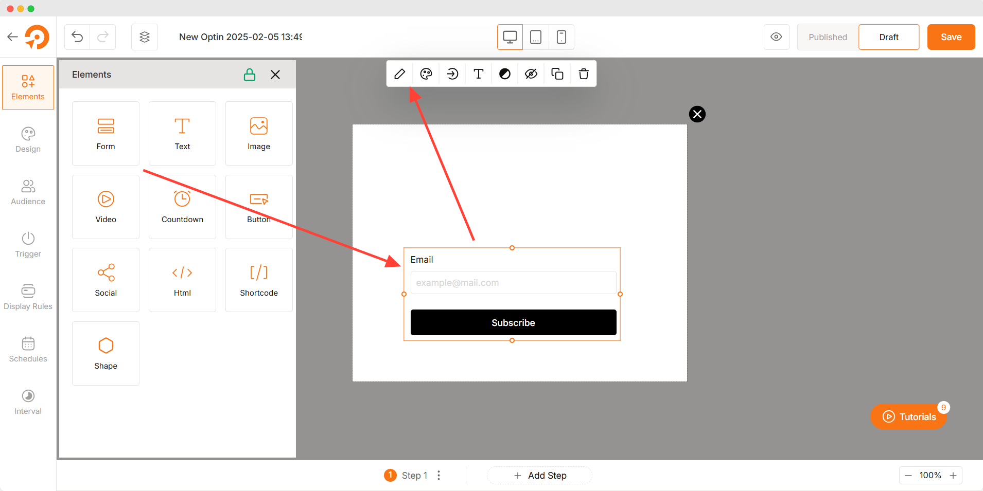
How to Use Form Element
- Drag and drop the Form Element into the canvas.
- Add and customize form fields to match your data collection needs.
- Define post-submission actions to control what happens after a user submits the form.
- Adjust styles, typography, and colors for a cohesive design.
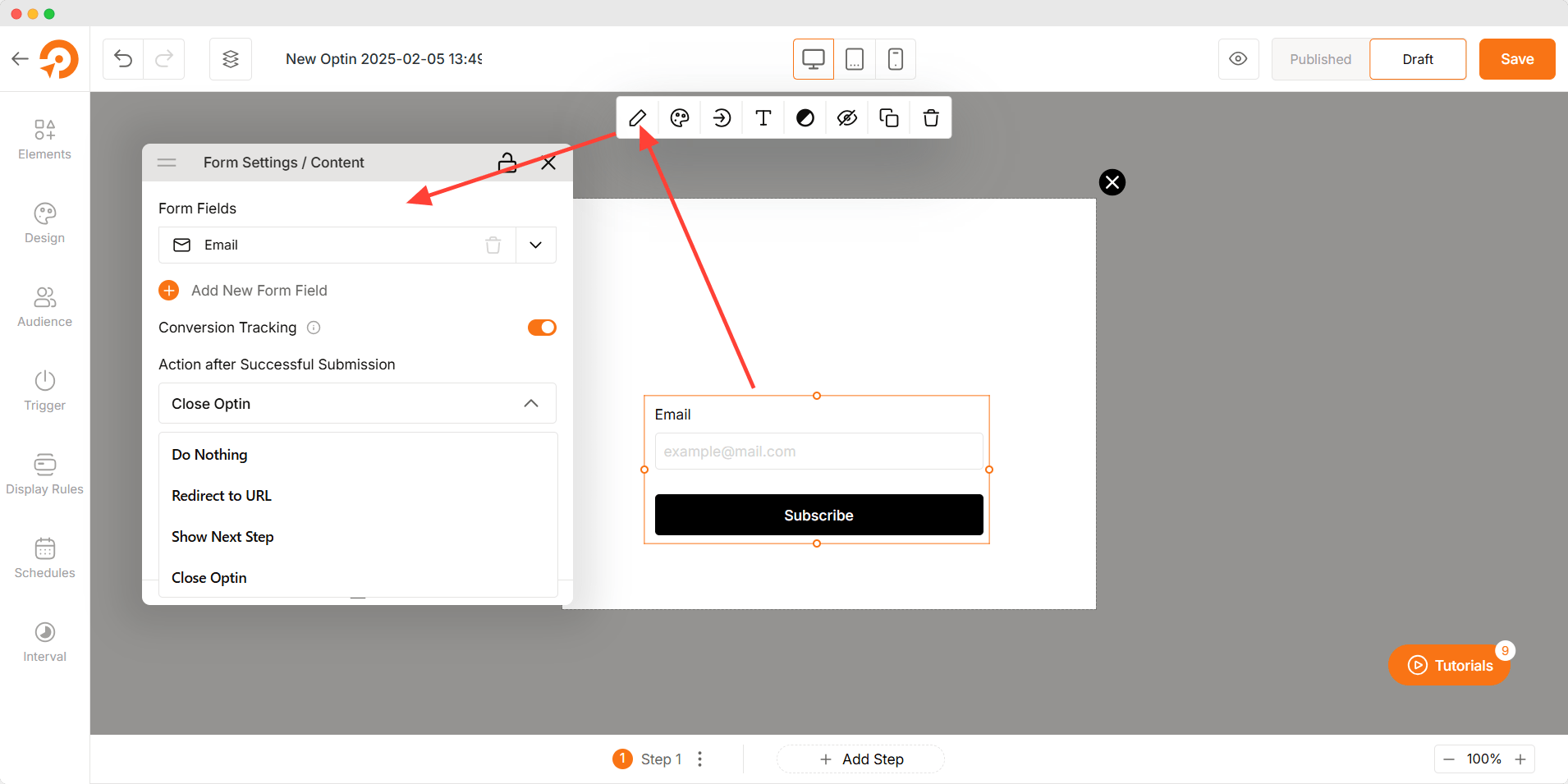
Form Content
- Form Fields: Customize each field with the following options:
- Field ID: A unique identifier for backend tracking.
- Label Text: The visible name of the field.
- Placeholder Text: A hint inside the field to guide users.
- Help Text: Additional instructions below the field.
- Required: Make the field mandatory or optional.
- Add New Form Field: Choose from the following field types:
- Full Name
- First Name
- Last Name
- Phone Number
- Text
- Conversion Tracking: Enable tracking to analyze form submissions.
- Action after Successful Submission: Select what happens next:
- Do Nothing: The form remains visible with no further action.
- Redirect to URL: Send users to a custom webpage.
- Show Next Step: Load another section or step within the form.
- Close Opt-in: Automatically close the form after submission.
Form Styles
- Enable Label: Show or hide form field labels.
- Label Placement: Adjust label positioning (above, inside, or beside the field).
- Space Between Label & Field: Control the gap between labels and fields.
- Space Between Field & Help Text: Adjust the spacing between fields and help text.
- Border: Customize form field borders.
- Border Type: Choose from solid, dashed, or dotted borders.
- Border Radius: Define how rounded or sharp the form edges appear.
- Shadow: Add depth with box shadows around the form.

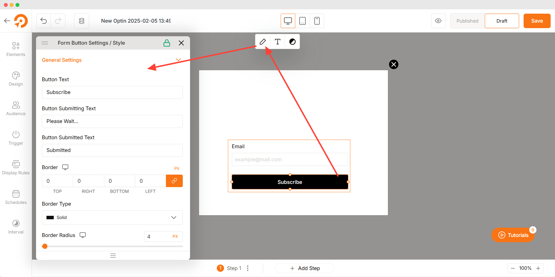
Button Styles
- Button Text: Customize the default button text (e.g., “Submit” or “Sign Up”).
- Button Text During Submission: Define text shown while the form is submitting (e.g., “Processing…”).
- Button Text After Submission: Set the text that appears after a successful submission (e.g., “Thank You!”).
- Border: Adjust the border of the button.
- Border Type: Choose from solid, dashed, or dotted borders.
- Border Radius: Control how rounded the button corners appear.
- Button Shadow: Apply shadows to enhance button visibility.
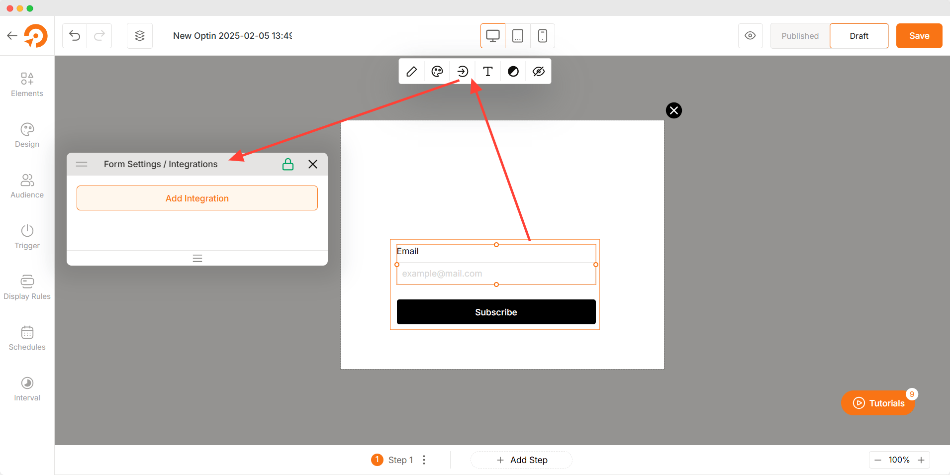
Integration Settings
This section describes the Integration Settings panel, which allows you to connect your forms with various third-party services and utilize webhooks for custom integrations.
To access the Integration Settings:
- Click on the Form element
- Navigate to the “Integrations” Icon on the top sticky bar.
- Click the Add Integration button.
The Integration Settings panel is divided into two options.
Third-Party Integrations: Clicking Enable Integrations will redirect you to WowOptin’s Integration page to add integration.
WP Plugins & Webhooks: This section lets you Connect your form to WordPress plugins or set up webhooks to send data to external URLs in real time.
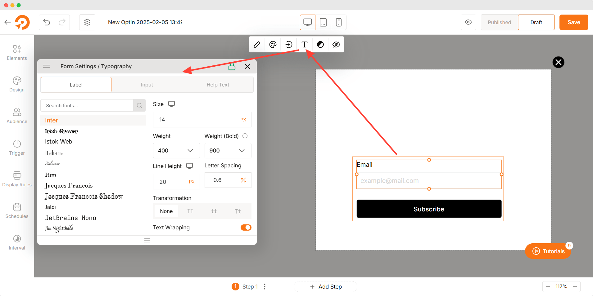
Typography
- Font Selection: Choose from a variety of fonts.
- Font Size: Adjust text size for readability.
- Font Weight: Modify text thickness from light to bold.
- Line Height: Control spacing between lines for better clarity.
- Letter Spacing: Adjust the distance between characters.
- Text Transformation: Convert text to uppercase, lowercase, or capitalize.
- Text Wrapping: Manage text overflow for a clean layout.
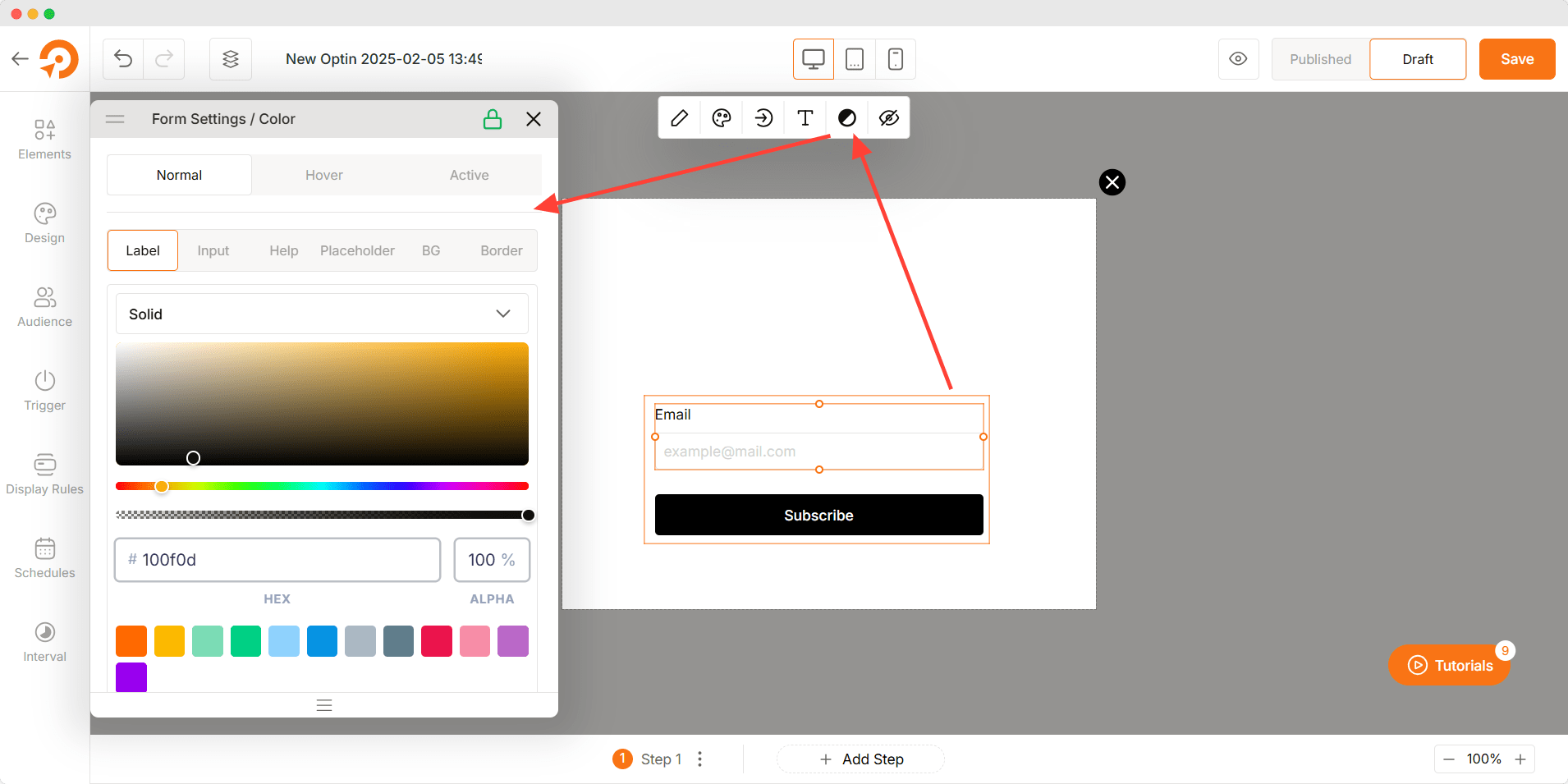
Color Customization
- Label: Adjust the color of form field labels.
- Input: Set the color of input text.
- Help: Customize the color of help text.
- Placeholder: Define the color of placeholder text inside fields.
- Background (BG): Select a background color for the form.
- Border: Customize the border color of form fields.
Troubleshooting
- Form Not Submitting: Check required fields and submission settings.
- Text Not Visible: Ensure contrast between text and background colors.
- Button Not Working: Verify the button action is correctly configured.
- Fields Misaligned: Adjust spacing and alignment settings for a structured layout.